Call : 773-914-0023


Email : paul@paulgorney.com

How Do 3 Of The Top Chicago High-Rises Compare?

Looking at The Pinnacle, 55 East Erie, and The Trump buildings

Despite their similarities, the condos at Huron, Wabash and Erie have a few interesting differences when it comes to their sales. Consider, for example, this table with a few average statistics for sold apartment homes on all three buildings:

Final Sale Price Market Time (in days) % Change from Original List Price*
Huron- The Pinnacle $1,061,596 130.84 -8%
55 East Erie $1,569,300 85 -4%
Wabash- The Trump $1,647,333 210 -11%

*40% of Huron, 13.3% of Erie, and 36.5% of Wabash properties decreased their listing price. The “% Change from Original List Price” figures are averages only among houses that revised their price.

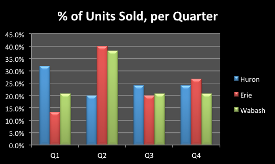
Below are the distributions of sold properties, divided among quarters of the year (January through March, April to June, July to September, and October to December) for the units in The Pinnacle (Huron), 55 East Erie, and The Trump (Wabash). The scale indicates during which quarter properties were sold. For example, the majority of 55 East Erie’s properties were sold during the second quarter of the year, or during the months of April, May and June.

Screen Shot 2015-08-14 at 4.13.01 PM


An easier way to visualize and compare all three areas is the bar graph below. Note that now the colors do not correspond to the time of the year, but rather to the locations.


Screen Shot 2015-08-14 at 4.13.10 PM

3 Key Comparisons Between the Evanston and Wilmette Real-Estate Markets

Despite their geographical proximity, both Evanston and Wilmette present a few differences between their Real-Estate statistics. Below are a few of the most notable ones:


1. Market Time per Month

So far in 2015, Evanston houses stayed on the market for an average of 55 days, while houses in Wilmette were closed within 34 days. Considering that the amount of houses fitting all categories for both Evanston and Wilmette were the same, this is a significant difference, pointing to Wilmette as having higher demand and thus quicker Real-Estate movement.

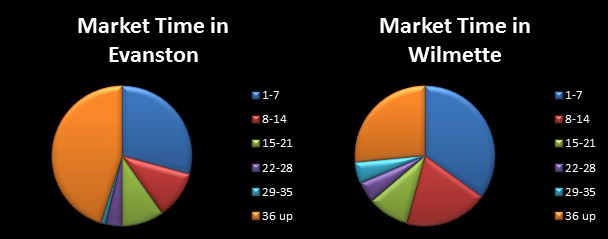
Besides averages, however, exactly how fast are these properties being sold? The charts below show the distribution of these (closed) houses based on how many were sold within different time intervals. The colored legends specify 6 periods: houses sold within 1, 2, 3, 4, and 5 weeks, as well as houses that stayed longer than 5 weeks in the market (numbers represent days).

Blog Post 1 pic 1

We can spot a significant increase in properties sold within 1 and 2 weeks at Wilmette, which seem to easily outnumber its Evanston counterparts.


2. Supply and Demand Fluctuations

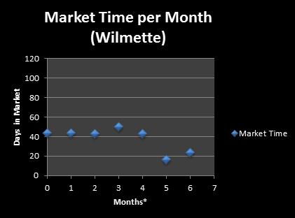
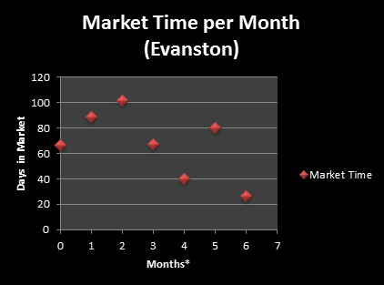
In Chicago, market movement seems to synchronize perfectly with spring, blooming at around March. Data clearly shows that seller surplus (price of sale minus listed price) is highest during March and April. Wilmette’s market lines up accurately with the overall Chicago movement, while Evanston’s house sales seem to peak a little earlier.

Blog Post 1 pic 2


Blog Post 1 pic 3

*In the graphs above, all Months are from 2015. “0” here corresponds to December 2014.

Another interesting observation is how Wilmette’s home movement seems to be more stable than Evanston’s, which has been oscillating since the beginning of the year. Up until April, most homes in Wilmette had been in the market for around 45 days before being sold; this changes drastically in May when properties seemed to start moving very rapidly.


3. Price Range

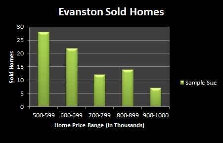
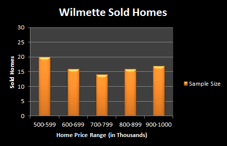
Evanston’s home movement seems even more dynamic when we take a look at sold houses per price range. Most of these properties fall into the $500k to $699k range. Contrastingly, Wilmette looks much more stable and centered at the higher price range of $700k-$799k.

Blog Post 1 pic 4


Blog Post 1 pic 5


A Closer Look at Glenview –and The Glen- Properties

Today we take a quick look at a few numbers on the Real-Estate market at Glenview, the suburban village located north of Chicago.

Over 23% of properties in the subdivision of The Glen saw price revisions, all of them a decrease from the original listing price. The revisions, in turn, averaged to a 4.8% price decrease. The area of Glenview as a whole, with the exception of houses at The Glen, had slightly higher percentage of houses changing their price: over 33%, for an average 6% price decrease. All in all, none of the closed properties at The Glen had multiple bidders, which almost always corresponds to offers above the asking price. The area of Glenview as a whole only had 4 houses in total sold for a price above the listing price.


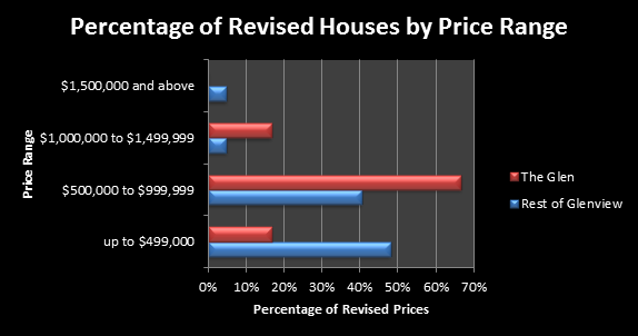
Revised Houses by Price Ranges

The graph below shows a key difference between houses at The Glen and houses in the rest of the Glenview area. As house price goes up, we see a decrease in the percentage of revised houses (houses which had their asking price decreased) of Glenview. Contrastingly, most properties in The Glen which had to lower their listing price are concentrated in the $500,000 to $999,999 price range, and all houses priced $1,500,000 or above did not have to change their listed price.

Blog post 3 pic 1

3 Tips for Winning – 2015 Chicago Spring Real Estate Market

Ready…set….buy!

The Chicago area housing market gains momentum and will start humming over the next few months. Here are 3 things to help you WIN:

1. Don’t be afraid of the cold!

Start early if you plan to buy. In Chicago, the market starts showing life after Jan. 1 or, as many people like to use as a barometer – the Superbowl. In the suburbs, things typically start moving Feb. 15th to March 1. All signs point to this being the case in 2015.

Many sellers who have had homes on the market previously are more motivated. Some have been on the market since last year and want to sell sooner, rather than later. There are fewer buyers in mid January than later in the spring. Fewer people to show interest, which means less demand and potentially a better price for a buyer. Things heat up significantly in the Chicago area real estate market (and, hopefully the weather!) in March to May. More things to consider but much more competition. The prices at the height of the spring can command 5-7% more in some of the most popular areas.

2. Timing is everything

If you are selling in a area with historically low inventory and high demand, wait until the peak of the market – March to April – to put your home up for sale. There will be a pent up demand and you will be able to create a perfect environment for a max price. You can cost yourself money if you put your house on the market too soon.

3. Spring time can be the best time…but for who?

While sellers can definitely hit a high mark, buyers can put themselves on the hook for a future loss. Make sure you are getting great, honest and experienced advice!